
Home / Blog / What Makes a Good Logo? Principles Every Brand Should Know
What Makes a Good Logo? Principles Every Brand Should Know
What makes a good logo is more than just visual appeal. This blog explains the core principles of good logo design and helps brands understand what makes a logo effective, memorable, and meaningful over time.
22 Apr, 2026
What Makes a Good Logo? Principles Every Brand Should Know
A logo is often the first visual connection people have with a brand. Before a customer reads your content, explores your product, or understands your values, they see your logo. That single mark carries a lot of responsibility.
Yet many brands struggle to answer a basic question: what makes a good logo?
Is it creativity? Simplicity? Color? Trendiness?
In reality, good logo design follows clear principles. A logo is not art for art’s sake it is a strategic branding tool.
This guide explains the core logo design principles every brand should know, helping you understand what truly makes a logo effective.
Why a Logo Matters More Than You Think
A logo is not just decoration. It serves multiple purposes:
- Identifies your brand instantly
- Builds recognition over time
- Creates emotional association
- Supports brand credibility
A poorly designed logo can confuse or repel audiences. A good logo quietly builds trust with every interaction.
Principle 1: Simplicity Is the Foundation of a Good Logo
The most effective logos are simple.
Simplicity allows a logo to:
- Be recognized quickly
- Be remembered easily
- Work across different formats
Complex logos may look impressive initially but often fail in real-world usage.
A good logo should be understandable at a glance, even from a distance.
Key takeaway:
If your logo needs explanation, it’s likely too complex.
Principle 2: Memorability Comes from Clarity, Not Detail
A good logo sticks in the mind.
This doesn’t happen through intricate designs, it happens through clear, distinctive shapes.
Memorable logos usually:
- Have a unique visual hook
- Avoid unnecessary elements
- Maintain consistent form
Memorability is especially important in crowded markets where brands compete for attention.
Principle 3: Relevance to the Brand Matters
A logo should align with what the brand represents.
This doesn’t mean:
- Using literal symbols
- Copying industry clichés
It means the logo should feel appropriate for:
- The brand’s audience
- The industry context
- The brand’s personality
For example, a playful startup and a legal firm require very different visual tones.
Principle 4: Scalability Is Non-Negotiable
A good logo works at every size.
It should look just as effective:
- On a mobile screen
- On a website header
- On packaging
- On large signage
Logos that rely on fine details or thin lines often fail when scaled down.
Scalability is one of the most overlooked principles in logo design.
Principle 5: Timelessness Beats Trends
Design trends come and go. Logos should not.
A trendy logo might feel modern today but outdated in a few years.
A good logo is designed to last.
Timeless logos:
- Avoid overly stylized effects
- Use balanced proportions
- Focus on core identity
This doesn’t mean logos should look old, it means they should remain relevant.
Principle 6: Color Should Be Intentional
Color plays a major role in how a logo is perceived.
Good logo design considers:
- Emotional impact of colors
- Cultural context
- Contrast and accessibility
A strong logo should also work:
- In black and white
- In grayscale
- Without color at all
If a logo only works in full color, it’s not versatile enough.
Principle 7: Typography Matters as Much as Symbols
Many logos rely entirely on typography. Even symbol-based logos often include text.
Typography affects:
- Readability
- Brand tone
- Professionalism
A good logo uses fonts that:
- Match the brand’s voice
- Are legible across sizes
- Don’t rely on trendy typefaces
Custom or carefully chosen typography adds uniqueness.
Principle 8: Versatility Across Platforms
A logo doesn’t live in one place.
It appears on:
- Websites
- Social media
- Emails
- Packaging
- Marketing materials
A good logo is flexible enough to adapt without losing its identity.
This includes horizontal, vertical, and icon-based variations.
Common Logo Design Mistakes Brands Make
- Overloading the logo with details
- Copying competitors
- Designing only for digital use
- Ignoring brand strategy
- Following trends blindly
These mistakes reduce effectiveness and longevity.
Good Logo vs Bad Logo: What’s the Real Difference?
A good logo:
- Communicates clearly
- Feels intentional
- Works everywhere
- Supports brand growth
A bad logo:
- Confuses audiences
- Feels generic
- Breaks at small sizes
- Needs frequent redesigns
The difference lies in principles, not decoration.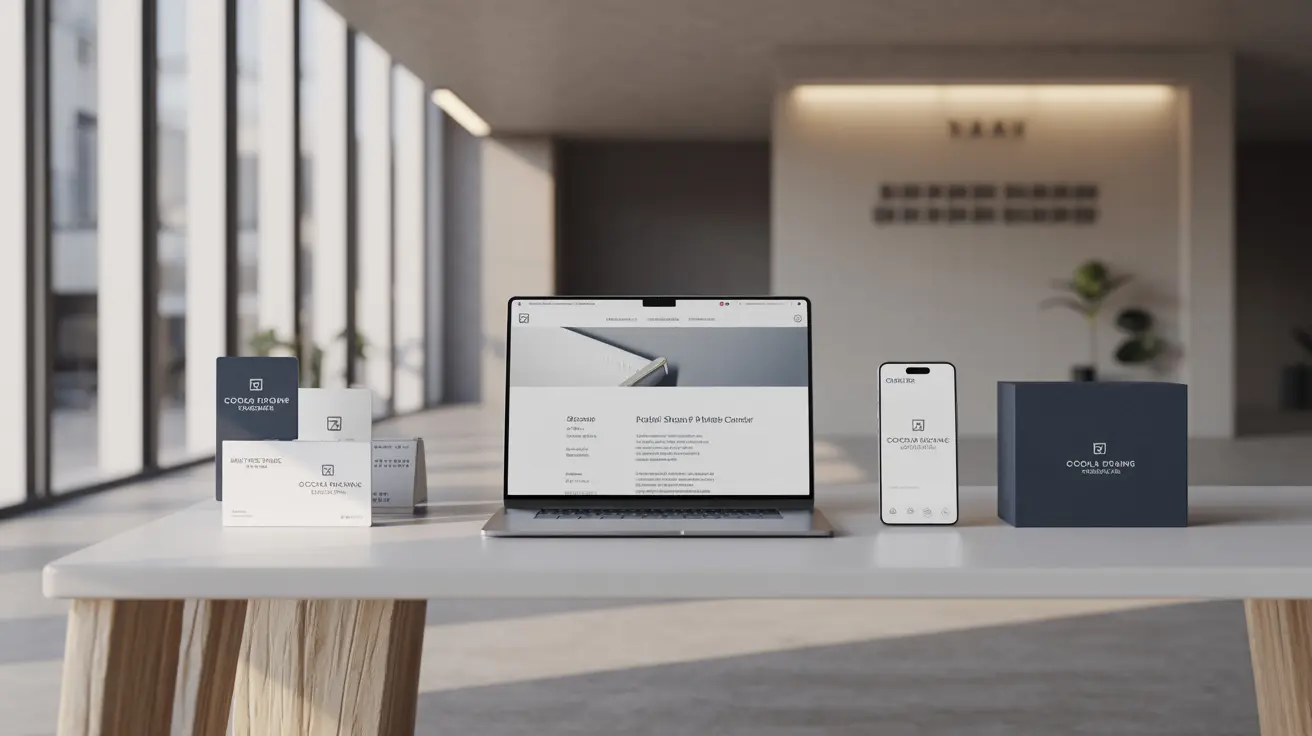
How Logo Design Supports Brand Growth
A strong logo:
- Improves brand recall
- Builds trust faster
- Creates consistency
- Strengthens marketing efforts
While a logo alone won’t build a brand, a weak logo can slow brand growth significantly.
When Should a Brand Redesign Its Logo?
Not every logo needs a redesign.
Consider it only if:
- The brand direction has changed
- The logo no longer scales well
- The design feels outdated
- The logo doesn’t reflect brand values
Redesign should be strategic, not reactive.
How 10Turtle Approaches Logo Design
At 10Turtle, logo design starts with understanding:
- Brand purpose
- Audience perception
- Long-term goals
Design decisions are guided by principles, not trends, ensuring logos remain relevant and effective over time.
FAQs
Q-1. What makes a logo good?
A-1. A good logo is simple, memorable, scalable, relevant to the brand, and versatile across platforms.
Q-2. Why is simplicity important in logo design?
A-2. Simple logos are easier to recognize, remember, and reproduce across different sizes and formats.
Q-3. Can a logo be too simple?
A-3. Yes, if simplicity removes distinctiveness. A good logo balances simplicity with uniqueness.
Q-4. How important is color in a logo?
A-4. Color influences perception, but a strong logo should also work without color.
Q-5. Should logos follow design trends?
A-5. Trends can inspire, but logos should focus on longevity rather than short-term styles.
Q-6. How often should a logo be redesigned?
A-6. Only when the brand has evolved significantly or the logo no longer functions effectively.
Q-7. Can typography alone make a strong logo?
A-7. Yes. Many effective logos rely solely on typography when chosen and applied thoughtfully.



_1_11zon-1762758103181.webp)